Skip To Main

our work

work with us
Collage of screens from the LingroLearning UX/UI update

LingroLearning

Simplifying learning experiences to support growth

BEFORE

Language learning company striving to increase user engagement and market share

Instructional resources had outgrown platform’s original design

Needed to modernize and optimize design to expand its offerings and reach in the hard-to-penetrate education software space

100 Best Companies to work for in Oregon 2024

AFTER

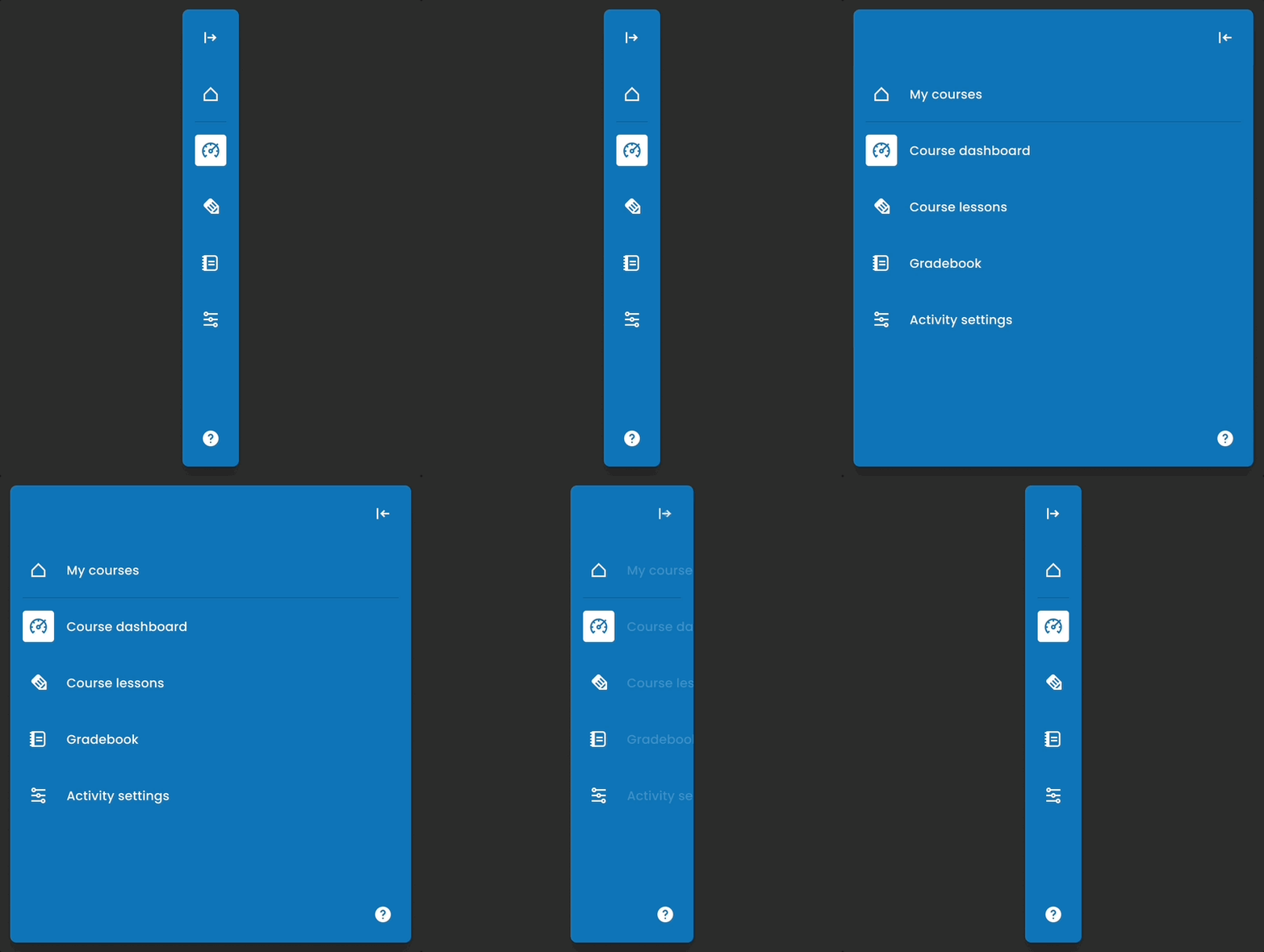
Restructured platform’s information architecture to support intuitive navigation for teacher and student users

Designed updates to platform’s iconography, fonts, and colors for a modernized look and to comply with accessibility standards

Delivered prioritized design recommendations with implementation-ready designs

Challenge

A redesign with growth in mind

Language learning software is a competitive market, with a few established providers strongly positioned to resist challengers and change. In a space primed for evolution, LingroLearning saw an opportunity to bring new value to high school and university language courses with fresh instructional content and methodologies shaped by the latest in linguistic education pedagogy. But the original design of its platform was difficult to navigate for many of its users, so they asked us to create a redesign plan to improve the experience and increase engagement.

Process

Defining criteria for success

The LingroLearning team asked us to identify places to update its platform’s look, feel, information architecture (IA), and content management features to minimize friction and maximize user engagement in the delivery of its unique instructional offerings. They also requested estimates for the level of effort required to implement each recommendation, so they could start moving forward with less complex tasks quickly while preparing the way for more impactful changes down the line.

Process

Assessing “before”, envisioning “after”

We conducted a full audit of the platform’s UI, IA, and key user flows, from the perspectives of teachers and students, identifying patterns to rework and individual opportunities to improve the UX. In addition to the areas highlighted by LingroLearning (modernizing UI, simplifying navigation), we also identified a need to update the platform’s content management tools, making it simpler for teachers to create lessons and lesson plans (the core activities of the platform that determine the usage frequency for instructors and students). We organized these insights by category, ranked them according to complexity, and set out to generate high-fidelity design assets illustrating our recommendations for evaluation by LingroLearning’s team.

Solution

Reimagined for modern users

Ed tech is plagued by outdated-looking software, and LingroLearning wanted to stand out from its slow-to-change competitors. We updated the branding used in the platform – including fonts, colors, and other stylistic elements and conventions – to elevate LingroLearning’s UI to match its innovative, future-focused energy (taking accessibility standards into account in the process).

Solution

Creating visual clarity

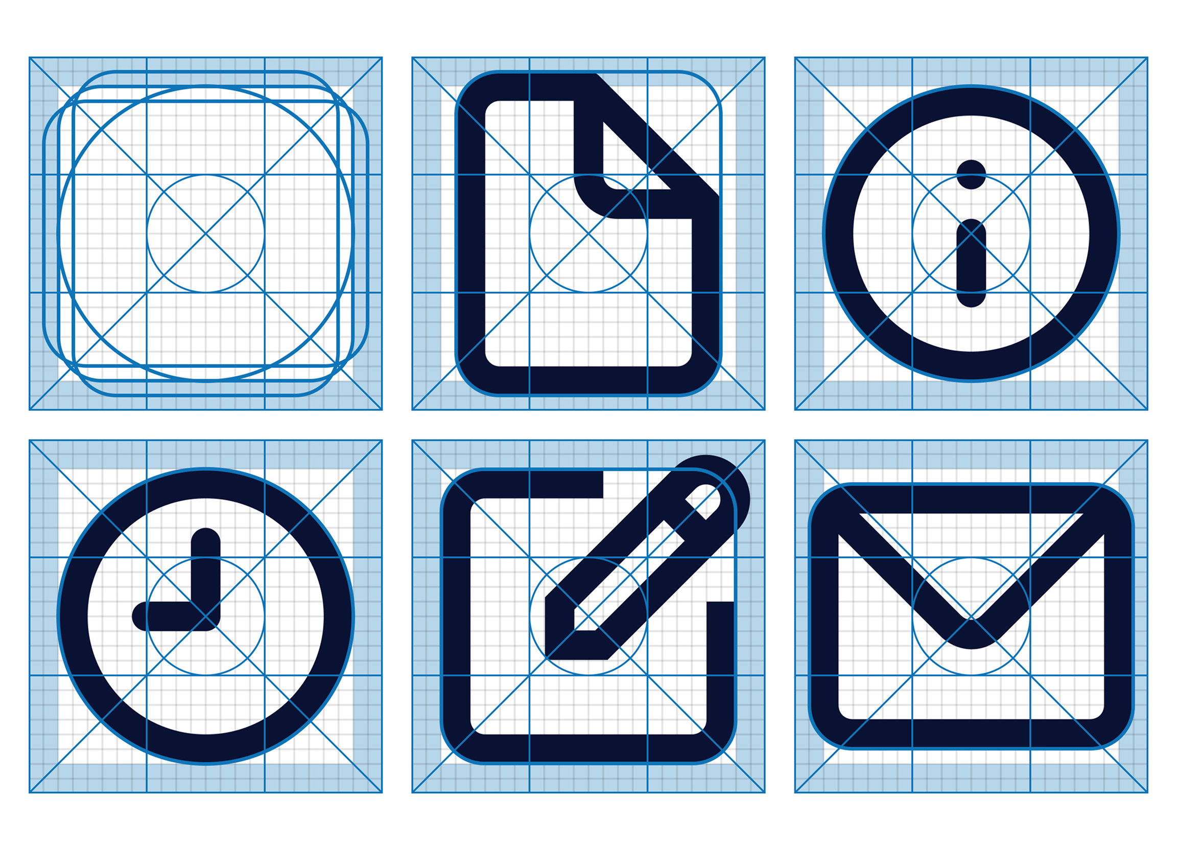
The icons used throughout the platform had been added at different times in LingroLearning’s evolution, introducing inconsistencies in style and ambiguities in meaning. We reevaluated the goal and appearance of each element in relation to its function and to the updated UI, making adjustments as needed to create a consistent, intuitive iconography system to reinforce the platform’s new navigation pathways and updated aesthetic.

Solution

Instructional content made manageable

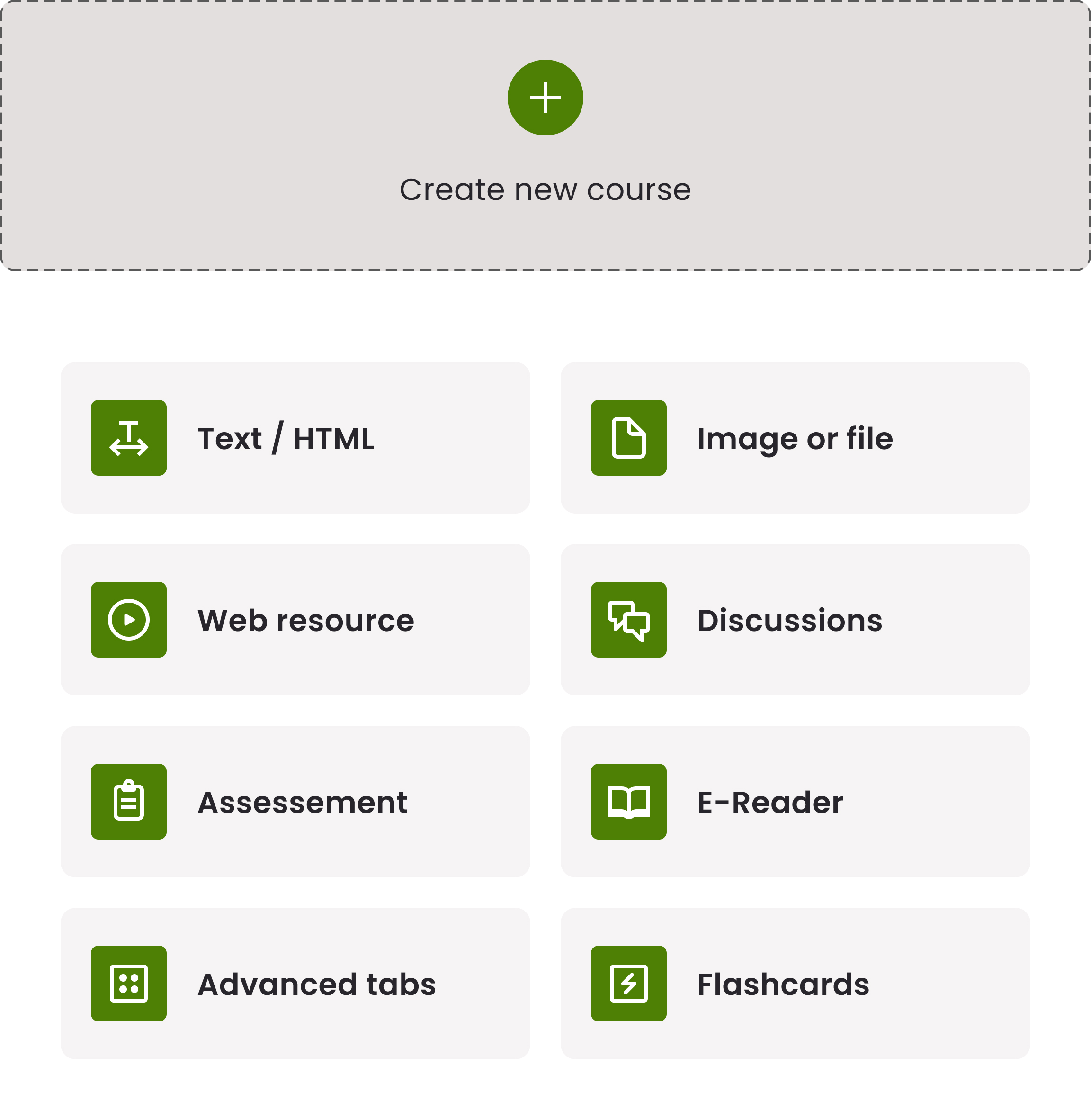
When it comes to creating lessons and activities, LingroLearning offers instructors plenty of options – but in the platform’s original version, non-technical users had difficulty putting those pieces together. We redesigned the content creation interface to surface primary actions (like “add section” and “edit”) and incorporated toasts and help text to help teachers keep track of potential and completed actions within the creation flow.

Solution

From oversight, to insightful

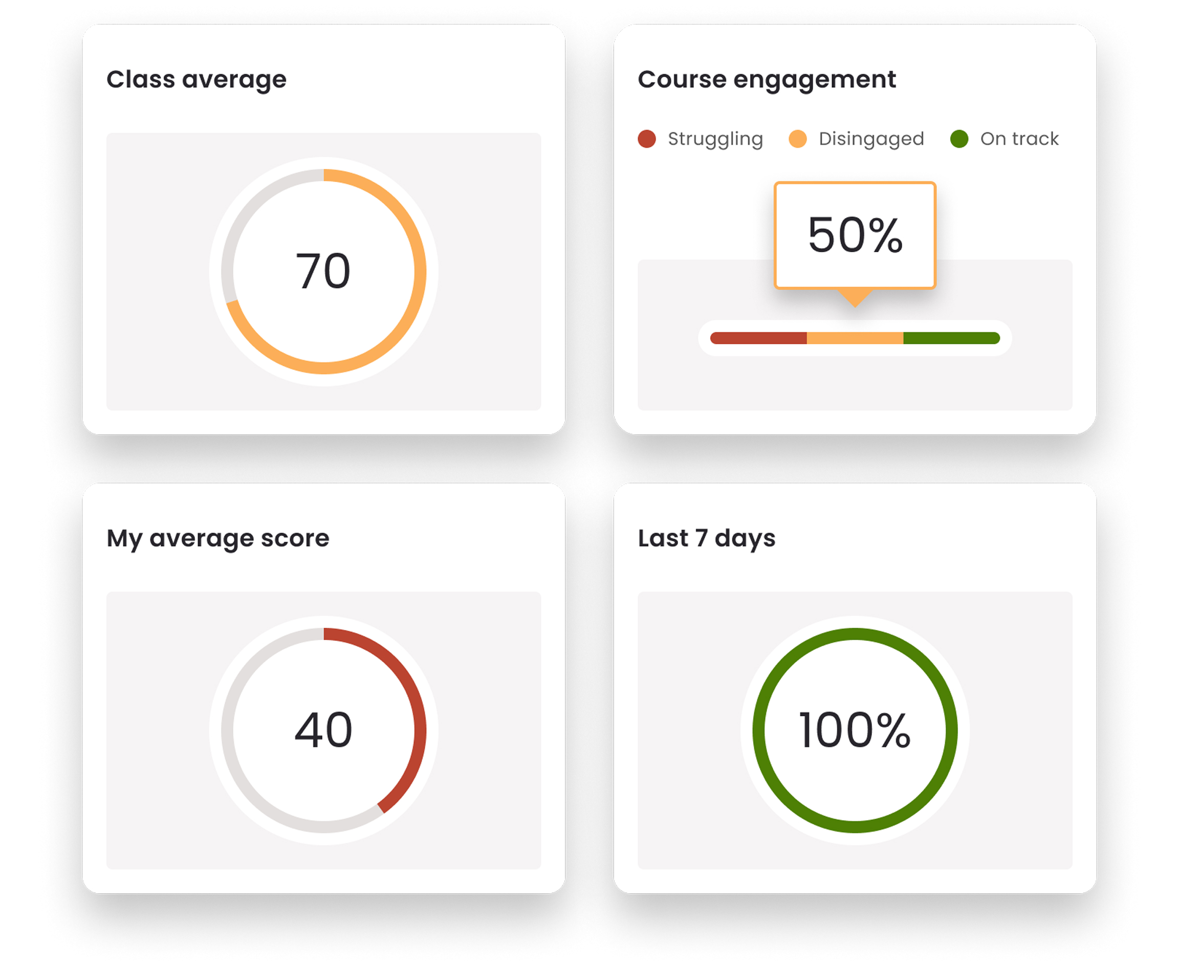
Both teachers and students had access to summary performance metrics (class-wide for teachers, and on the individual level for students). But LingroLearning’s user research discovered that users didn’t find this information very clear or helpful in its original presentation. We changed the chart types, visual hierarchy, and labeling to give users the most essential information at a glance, with drill-down options to provide depth on-demand as needed.

Praise from our clients

We really enjoyed the collaboration process and loved the changes you proposed. We were all eager to move forward with your recommendations, and the transformation exceeded our expectations!

stem

Samantha Alducin

Co-founder & CEO of LingroLearning

I’m blown away by the work, both the degree of thoughtfulness behind your recommendations as well as the final designs…just beautiful!

stem

Steve Debow

Co-founder of LingroLearning

up next

UBI: Creating an Interactive Exploration

We partnered with social equity advocates to design and build an educational tool for demonstrating the potential effects of Universal Basic Income policies

View Projectall

All